Order Tracking Best Practices
For the best Order Tracking experience, consider the following best practices.
Use the right solution or combination of solutions for your users
Review the Order Tracking User Experiences to familiarize yourself with the options that Order Tracking gives you. The solutions can be considered to be most to least passive in this order:
Shopping website including the My Software All Orders page
The user has to go to the website to see the status. And other than the My Software link icon's numbers, they won't see the status changes until they go to the My Software All Orders page
This option is appropriate for users that only want to retrieve status when they want it. However, this assumes that the users know to go to the Shopping website for status
Windows notification area icon
The user has to click on the icon to see the status. This assumes the user knows to click on the icon, or that they discover it
This option is especially passive if you don't ensure the Shopping icon is visible to your users, as discussed below
Windows action center toast notifications
The user will see the toast notifications in the lower right corner of their computer temporarily if they're working on their computer
Even if the user doesn't see the notifications when they are first presented, the user will see them later when reviewing other action center notifications
Emails
The user will see the emails when they read their other emails. Unless the user redirects the emails to a folder or auto-deletes them, the user must see the emails
You can use all these options with all notifications, but that would probably annoy your users. If you're confident that users will find and use the Windows notification area icon, you might use that in that it's highly focused, current, and not very intrusive. Otherwise you could use the toast notifications - they are more visible but will be mixed in with other notifications. For those notifications that you believe to be most significant (such as successes and failures), you could enable emails to be confident that users have received the status. They could be redundant to the other notifications, but they are important enough that such redundancy is justified.
For the download in progress message, we suggest using the toast notifications only. For large downloads, multiple download notifications could be produced. That would result in too many emails and since the Shopping notification area icon lists all messages, it would have many largely redundant notifications. The Windows action center only shows a few of the most recent notifications by default. The action center also briefly pops up the current status and replaces it if a new notification arrives before it disappears. Thus, the action center displays a pleasant real-time download progress.
Review, enable, and edit the notification texts
You should read the Order Tracking notification texts on the Managing Order Tracking web page and consider whether they will make sense to your users as is.
In most case Shopping requests are processed quickly and so most intermediate notifications are rarely seen by users.
Review and edit the notification emails
You can review and edit the notification emails as described on the Editing or localizing Shoppingpage.
Customize the Shopping notification area icon and name to match your Shopping website
If you have customized your Shopping website's icon or name, you should change the notification area icon and name to match. You can change other texts as well if you like. See the Customizations page for details.
Test the user experience
You should have a test lab (possibly a single virtual server) that you can install Shopping in. Using this environment, disable the option to only show intermediate updates. You can then request Shopping applications using test clients (possibly the single virtual server with the 1E Client installed). View the notifications and the emails as the users will see them. You will receive many more notifications and emails than the users will but you can review the experience and text to determine if changes should be made.
Ensure your users know how to suppress Windows action center notifications
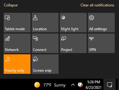
We hope your users will find the Shopping Windows action center notifications icons to be very useful, but there might be time when they don't want notifications to appear. That would likely be true for all notifications. To suppress the notifications:
Click the action center icon
Click the Focus Assist tile. The tile will indicate that only priority notifications will be shown. The action center icon will include a moon
Clicking the Focus Assist tile again will allow only alarm notifications to be sent. Shopping notifications are neither priority nor alarm notifications.
Clicking the Focus Assist tile once again will allow all notifications to be displayed again, including Shopping's. The moon on the action center icon is removed

Encourage your users to keep the Shopping notification area icon visible
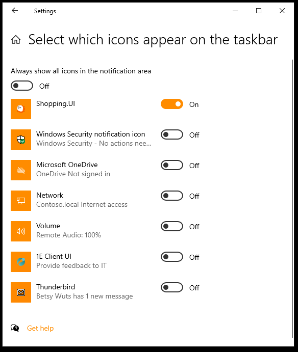
By design, notification area icon visibility is controlled by users, ensuring that they get their best computing experience. However, you can encourage them to enable the Shopping icon.
Easy instructions for users:
Go to the Windows Start menu
Type "taskbar" and hit enter
Near the bottom of the window that opens, click on the Select which icons appear on the taskbar
Set the Shopping.UI switch to On
