Configuring tile presentation elements
To use any of the tile presentation elements you must include a reference to its schema in the DashboardTile element as follows:
Standard tables – http://www.1e.com/2009/StandardTable.xsd
Standard paragraphs – http://www.1e.com/2009/StandardParagraph.xsd
Standard charts – http://www.1e.com/2009/StandardChart.xsd
Standard single vales – http://www.1e.com/2009/StandardSingleValue.xsd
Standard tables
When using the table presentation element, include the following namespace definition in the DashboardTile element. The table definition in the presentation section uses the table object name:
xmlns:table="http://www.1e.com/2009/StandardTable.xsd"
The outer element for a table definition is <table:StandardTable></table:StandardTable> all other atrributes must be placed inside this. The columns for the table definition must be placed within <table:ColumnCollection></table:ColumnCollection>. The following attributes can be set for ColumnCollection:
Attributes | Default value | Notes |
|---|---|---|
ShowColumnHeader | Determines whether a header row is displayed for the table. Values are:
| |
CommandIdentifier | The command to use to populate the table. | |
BackgroundColor | Background color for the table in XAML color format: #OPRRGGBB where OP sets the color's opacity, RR, GG and BB sets the red, green and blue values respectively. For example, to set the background colour to green: BackgroundColor="FF00FF00" |
Inside <table:ColumnCollection>, add the <table:Column> attributes that define the actual contents of the table. The following attributes can be set for Column:
Attributes | Default value | Notes |
|---|---|---|
Type | Sets the format of the contents. See Enterprise View Image Resources for a list build-in images and Supported HTML 4 tags for further details. Values are:
| |
Width | Width for the column. | |
Title | Column title. This can be used to set the title directly instead of defining TitleCommandIdentifier and TitleBinding. NoteTitle takes precedence over TitleBinding. | |
TitleCommandIdentifier | Command to be used to determine the column's title. | |
TitleBinding | Binding from the command set in TitleCommandIdentifier to be used as the column's title. | |
TitleHeight | Row height. Title also sets the font size to be used for the header row. | |
ContentHeight | Height for the contents rows for the column. |
Standard paragraphs
You can place a single standard paragraph in either the StandardTable or the StandardChart element. It must be placed inside the element but outside the ColumnCollection or SeriesCollection. The paragraph uses a limited subset of HTML 4 for formatting the text. See Supported HTML 4 tags for further details.
Standard charts
When using the table presentation element you could include the following namespace definition in the DashboardTile element, the table definition in the presentation section uses the table object name:
xmlns:chart="http://www.1e.com/2009/StandardChart.xsd"
The outer element for a chart definition is <chart:StandardChart></chart:StandardChart> all other chart attribute are placed within this. The following attributes can be set for StandardChart:
Attributes | Default value | Description |
|---|---|---|
AxisYTitleCommandIdentifier | This must be set to a command that will retrieve the data for the chart. | |
LegendEnabled | Shows or hides the legend identifying each data series on a chart. Values are:
| |
AxisXTitle | Text for the X Axis title. AxisXTitle overrides AxisXTitleCommandIdentifier and AxisXTitleCommandBinding . | |
AxisXTitleCommandIdentifier | The X Axis title. Used in conjunction with AxisXTitleCommandBinding . | |
AxisXTitleCommandBinding | The X Axis title. AxisXTitleCommandBinding is retrieved from the results of AxisXTitleCommandIdentifier . | |
AxisYTitle | The Y Axis title. AxisYTitle overrides AxisYTitleCommandIdentifier and AxisYTitleCommandBinding . | |
AxisYTitleCommandIdentifier | The Y Axis title. Used in conjunction with AxisYTitleCommandBinding . | |
AxisYTitleCommandBinding | The Y Axis title. AxisYTitleCommandBinding is retrieved from the results of AxisYTitleCommandIdentifier . |
All the data series required for the chart should be placed inside the <chart:SeriesCollection></chart:SeriesCollection> element. Each data series is defined using <chart:Series></chart:Series>. The following attributes can be set for Series:
Attributes | Default value | Description |
|---|---|---|
AxisXFormatString | The format for AxisXLabelBinding . | |
AxisXLabelBinding | Must be bound to a value returned by CommandIdentifier . | |
CommandIdentifier | Sets a command that will retrieve the data for the series. | |
Color | The color for the chart series. | |
YValueBinding | Must be bound to a value returned by CommandIdentifier . | |
YValueFormatString | The format for the YValueBinding . | |
Type | Must be set to the type of the chart to be used to display the series. | |
LabelEnabled | Shows or hides the label. Values are:
| |
LegendText | Text for the series in the chart legend. | |
Name | Name for the series. |
Chart combinations
It is possible to combine different chart types by using a different chart for each data series. This is subject to the following restrictions:
The Pie and Doughnut charts cannot be combined with each other or any other chart
The Bar, StackedBar and StackedBar100 can be combined with each other but not with any other chart type
Chart types
The following table shows the chart types available for use with Enterprise View. The chart names are case sensitive so you need to be careful with capitalization of the chart names when adding them to the tile definitions.
Chart type | Chart | Notes | |
|---|---|---|---|
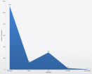
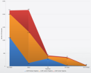
Area |
| Displays an area chart. This is a line chart that is filled to the X axis. | |
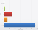
Bar |
| Displays a bar chart, where the y value for each value of x is shown as a horizontal bar. | |
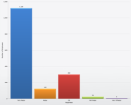
Column |
| Displays a column chart, where the y value for each value of x is shown as a vertical bar. | |
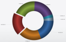
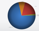
Doughnut |
| Displays a doughnut chart, where the y value for each distinct value of x is displayed as a sector of a ring. This shows the proportion between the distinct values. | |
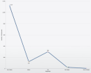
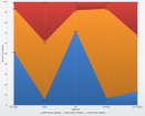
Line |
| Displays a line chart, where the y value is plotted against each distinct value for x. | |
Pie | >
| Displays a pie chart, where the y value for each distinct value of x is displayed as a sector of a circle. This shows the proportion between the distinct values. | |
Point |
| Displays a point chart, where the y value is plotted against each distinct value for x. | |
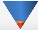
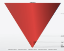
SectionFunnel |
| A section funnel chart is displayed as an inverted pyramid, where the shape of the chart is fixed and the different values are shown as layers inside. This allows the relative sizes of the values to be determined whilst indicating a general importance relationship between the parameters shown at the top and the ones at the bottom. | |
StackedArea |
| The stacked area chart shows each set of y values as area charts stacked above one another. This allows easy visualization of the proportions between the values and how these proportions change with the corresponding x values. | |
StackedArea100 |
| The stacked area 100 chart shows a stacked area chart where each set of y values is adjusted to show the percentage relationship between the individual values. | |
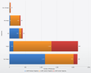
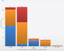
StackedBar |
| The stacked bar chart shows each set of y values as bars stacked beside one another. This allows easy visualization of the proportions between the values and how these proportions change with the corresponding x values. | |
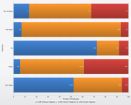
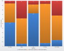
StackedBar100 |
| The stacked bar 100 chart shows a stacked bar chart where each set of y values is adjusted to show the percentage relationship between the individual values. | |
StackedColumn |
| The stacked bar chart shows each set of y values as bars stacked beside one another. This allows easy visualization of the proportions between the values and how these proportions change with the corresponding x values. | |
StackedColumn100 |
| The stacked bar 100 chart shows a stacked bar chart where each set of y values is adjusted to show the percentage relationship between the individual values. | |
StreamLineFunnel |
|
Standard single value
When using the standard single value presentation element you would include the following namespace definition in the DashboardTile element, the definition in the presentation section would subsequently use the value object name:
xmlns:value="http://www.1e.com/2009/StandardSingleValue.xsd"
The only standard single value type currently supported is the Gauge. This takes a single data binding and displays the value on a speedometer. Gauges require that the Activator attribute in the DashboardTile element is set to GaugeActivator.
Single value definitions
The tag for a single value definition is <value:StandardSingleValue></value:StandardSingleValue>. The following attributes can be set in the StandardSingleValue tag:
Attributes | Notes |
|---|---|
CommandIdentifier | The binding for the gauge. |
Binding | Parameter from the command used to set the value for the gauge. |
Type | Currently only the Gauge type is supported. |
MinimumValue | Minimum value for the gauge. |
MaximumValue | Maximum value for the gauge. |
Unit | Text for the units description that appears in the center of the gauge. |
Precision | Precision for the digit display. |