Assessing how Tachyon contributes to company DEX performance
A CIO uses the dashboard to see how Tachyon is benefiting their organization, get a feel for how their company DEX is looking, and see how their users rate their IT department.
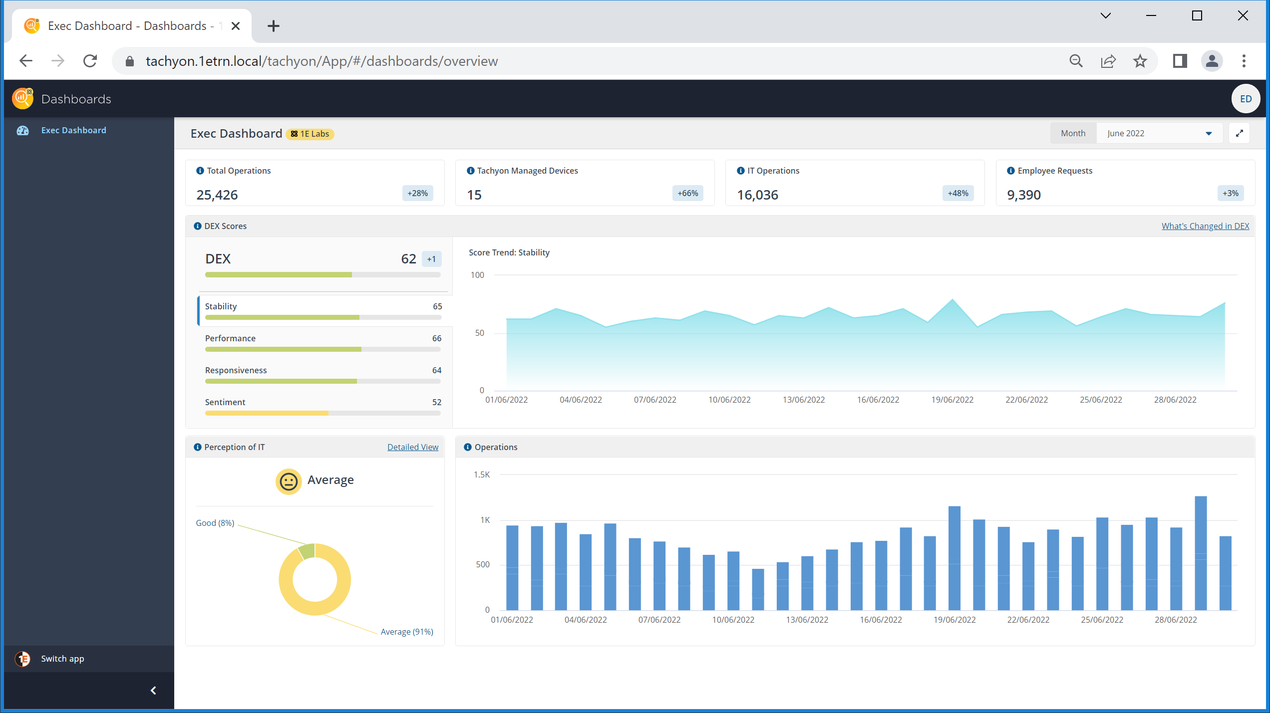
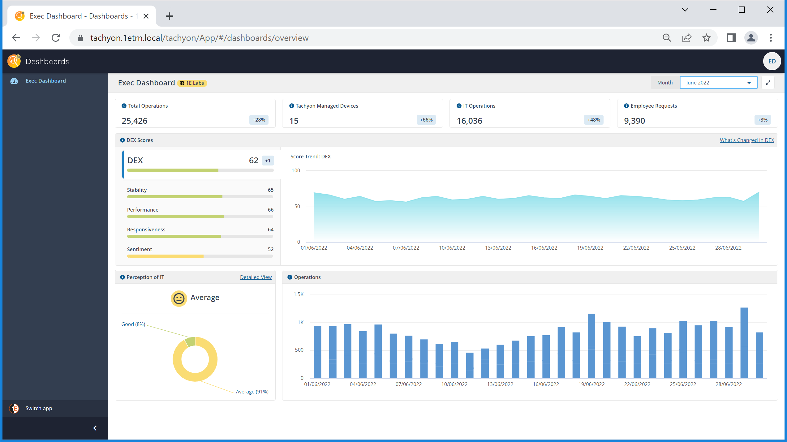
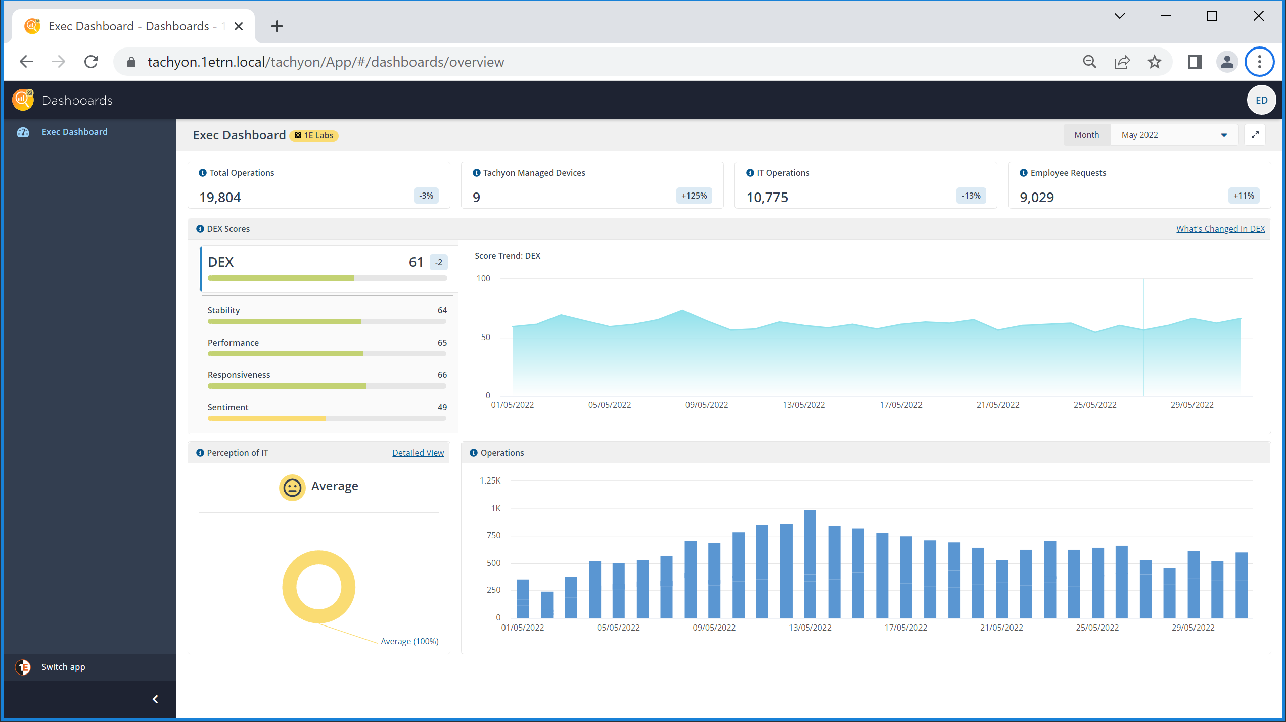
Viewing the headline information for the current month on the Exec Dashboard page
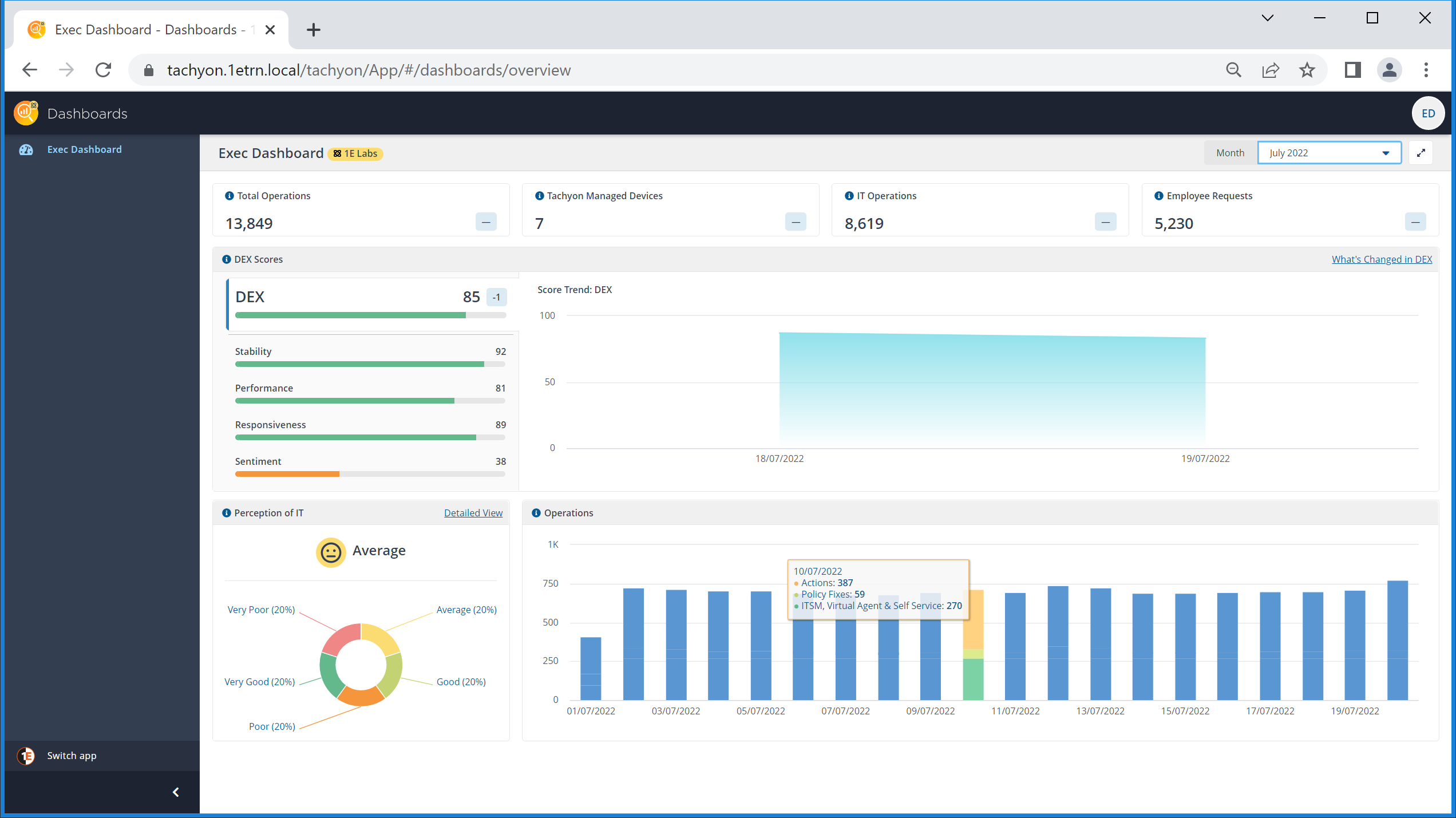
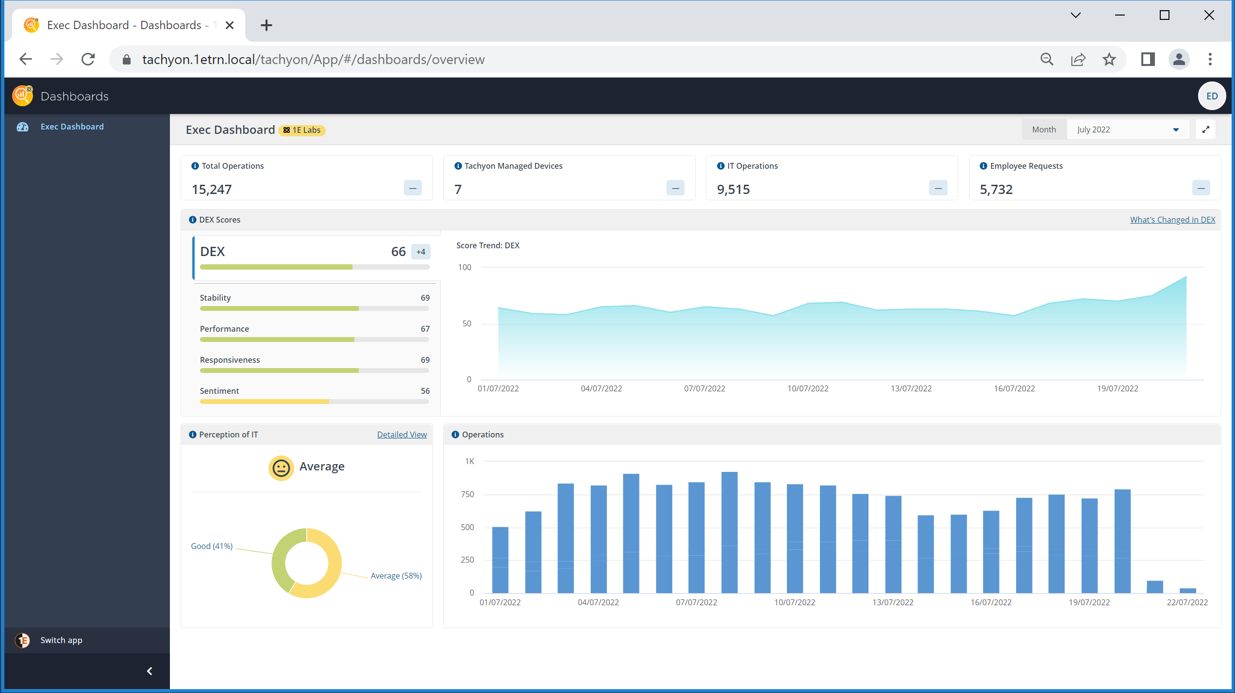
The CIO navigates to the page and sees the data for the current month displayed. Along the top row, they can see information about the way that Tachyon is performing in their environment: Total Operations, Tachyon Managed Devices, IT Operations and Employee Requests.
Tile | Description |
|---|---|
Total Operations | The Total Operations figure for this month is calculated as 15,135. This is the number of actions that have been performed on the network using Tachyon, and that's not including questions that have been asked to get back information that may have been useful in resolving end-user issues. There are a number of ways that Tachyon is prompted into action, and these fall into two main categories that are also displayed on the top-row: IT Operations and Employee Requests. |
Managed Devices | This tile shows the number of devices that have connected to Tachyon during the selected month. This shows how many devices are being managed using Tachyon and having actions performed on them. In this example, we're showing a lab environment with only a few devices. |
IT Operations | The IT Operations figure shows the number of Tachyon actions performed by the IT department using Tachyon, either run manually or using a scheduled instruction from Tachyon Explorer, or automatically performed using Guaranteed State. |
Employee Requests | Employee requests show the number of Tachyon actions that have been run as a result of users requesting items via ITSM, through the Virtual Assistant or using Shopping to select an instruction. |
Checking the daily details for Total Operations
Clicking on the Total Operations tile provides details on how that figure is derived for each day in the current month. This shows the CIO that so far today:
Their IT team was responsible for 464 actions, either run manually from Tachyon Explorer or using a scheduled instruction
Guaranteed State has automatically made 54 fixes to devices
Users have requested via ITSM, Virtual Assistant and Self-service instruction items in Shopping, 270 actions
leading to a total of 788 Tachyon operations for the day so far.
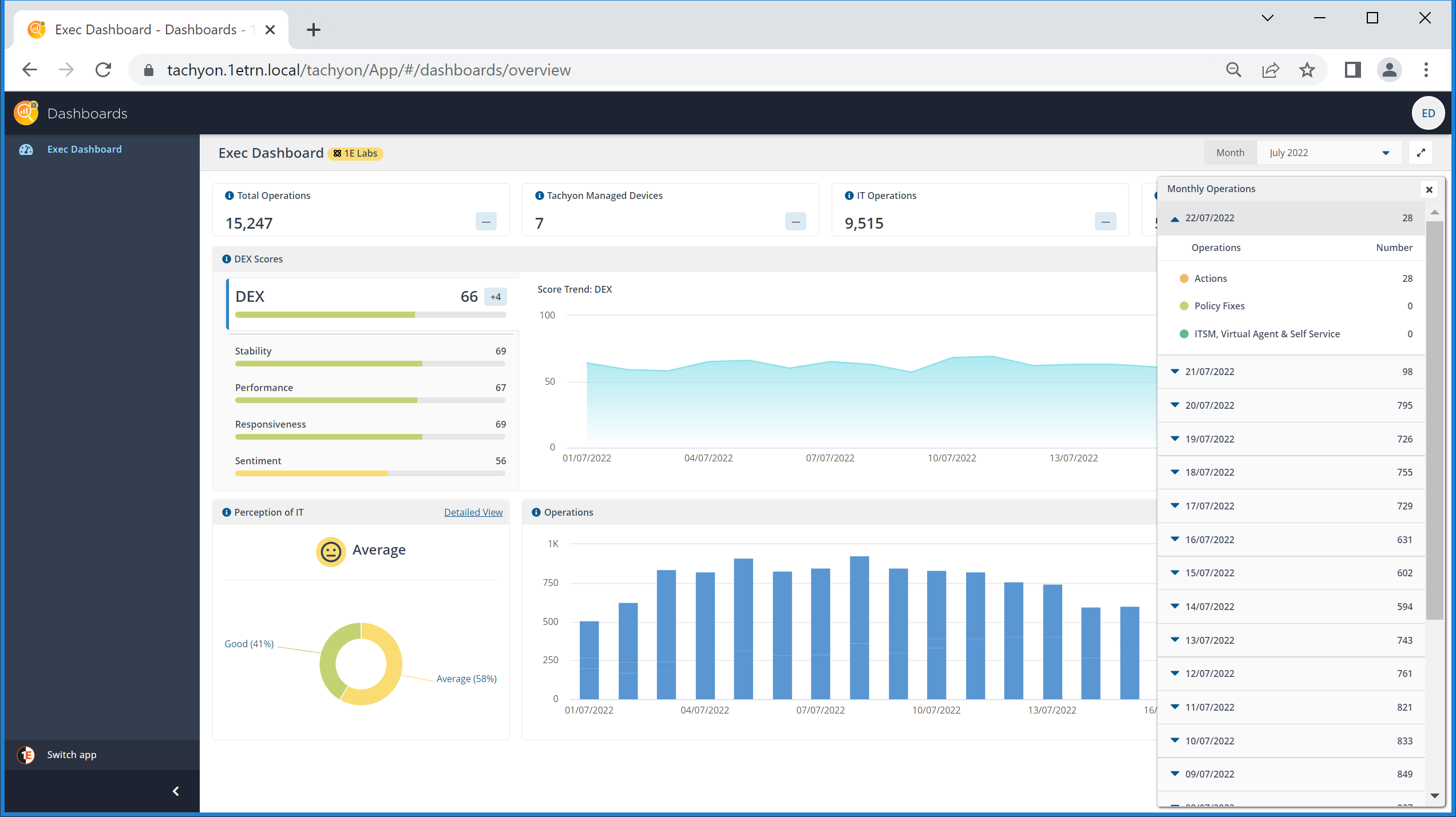
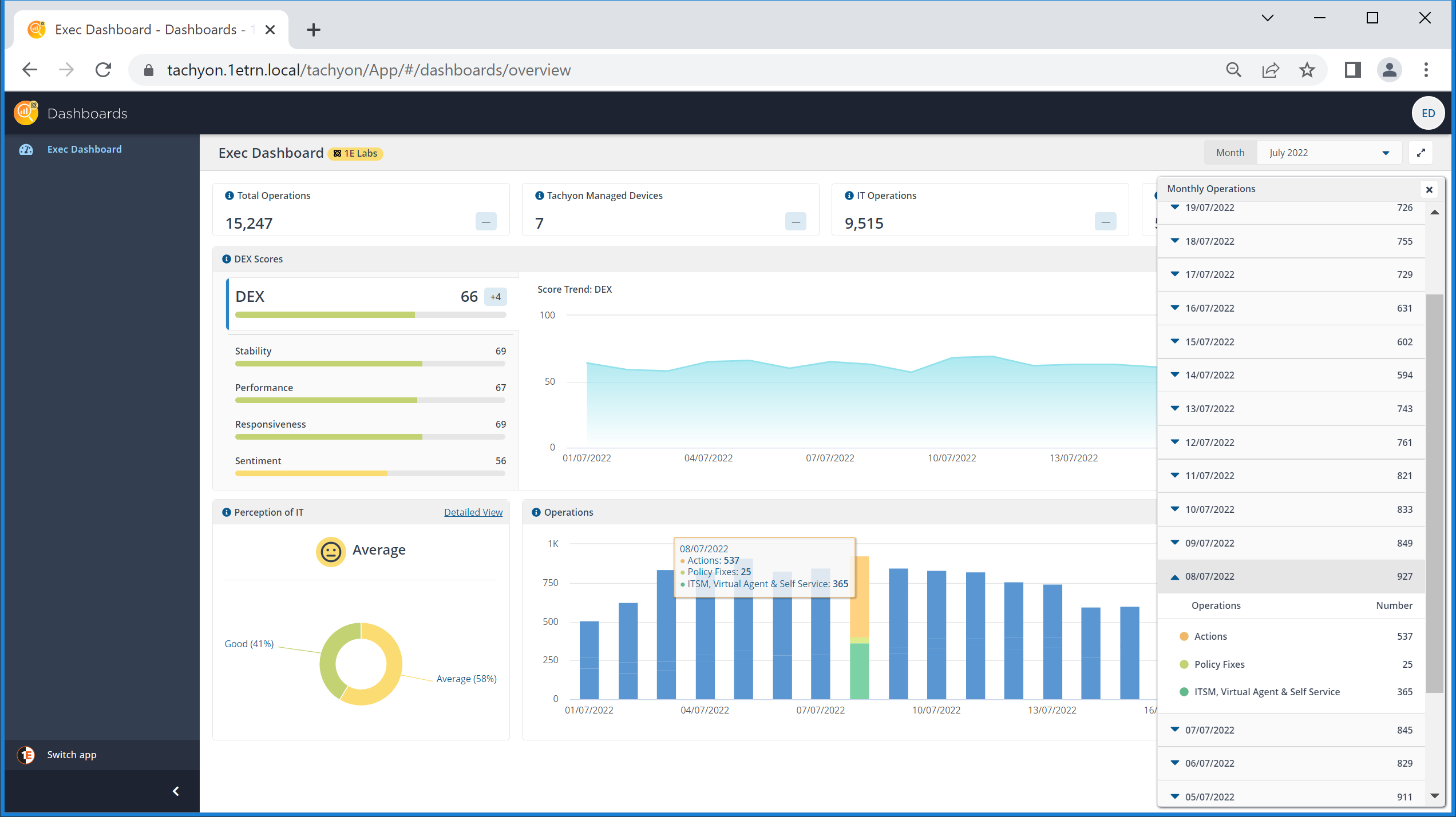
Checking the Operations chart for the highest number of Total Operations so far this month
The CIO can also see the breakdown of operations per day in the Operations tile along the bottom-right of the dashboard. Scanning across, they can see one day that stands out. Clicking on the bar for that day shows the make-up of the total:
537 actions
25 policy fixes
365 ITSM, Virtual Assistant & Self-service.
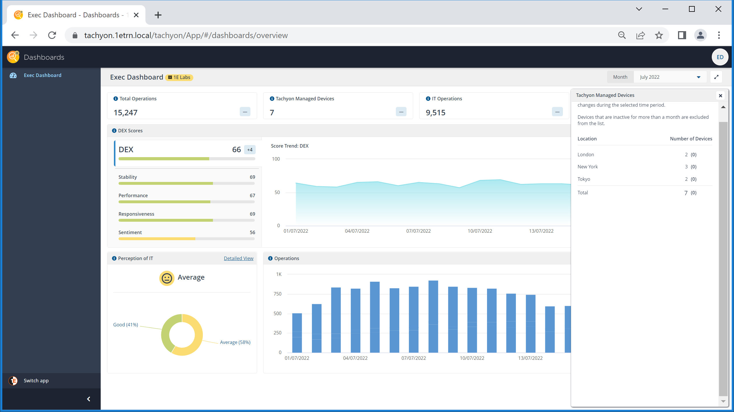
Viewing details for Tachyon Managed Devices
The CIO wants to find out more information about the devices that have connected to Tachyon during the current month. Clicking on the Managed Devices tile displays a breakdown of the devices organized into their locations, set using instructions.
Here they can see that they've had devices reporting back from all their locations, London, New York and Tokyo (not in high numbers, but this is a lab example).
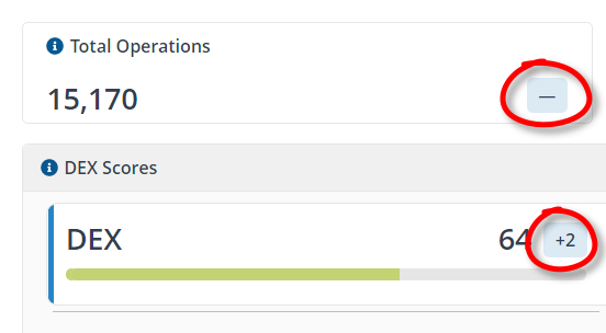
Change indicators
There is a change indicator at the bottom-right of each headline tile and at the top-right of the DEX score display. When the current month is displayed, the only indicator that shows any information is the DEX score display one, all the other ones display dashes. This is because the counted data in the headline tiles for the current month is incomplete, so comparisons with the previous month cannot be easily made.
The DEX score, is calculated as an average and displayed as a change in the score, not a percentage.
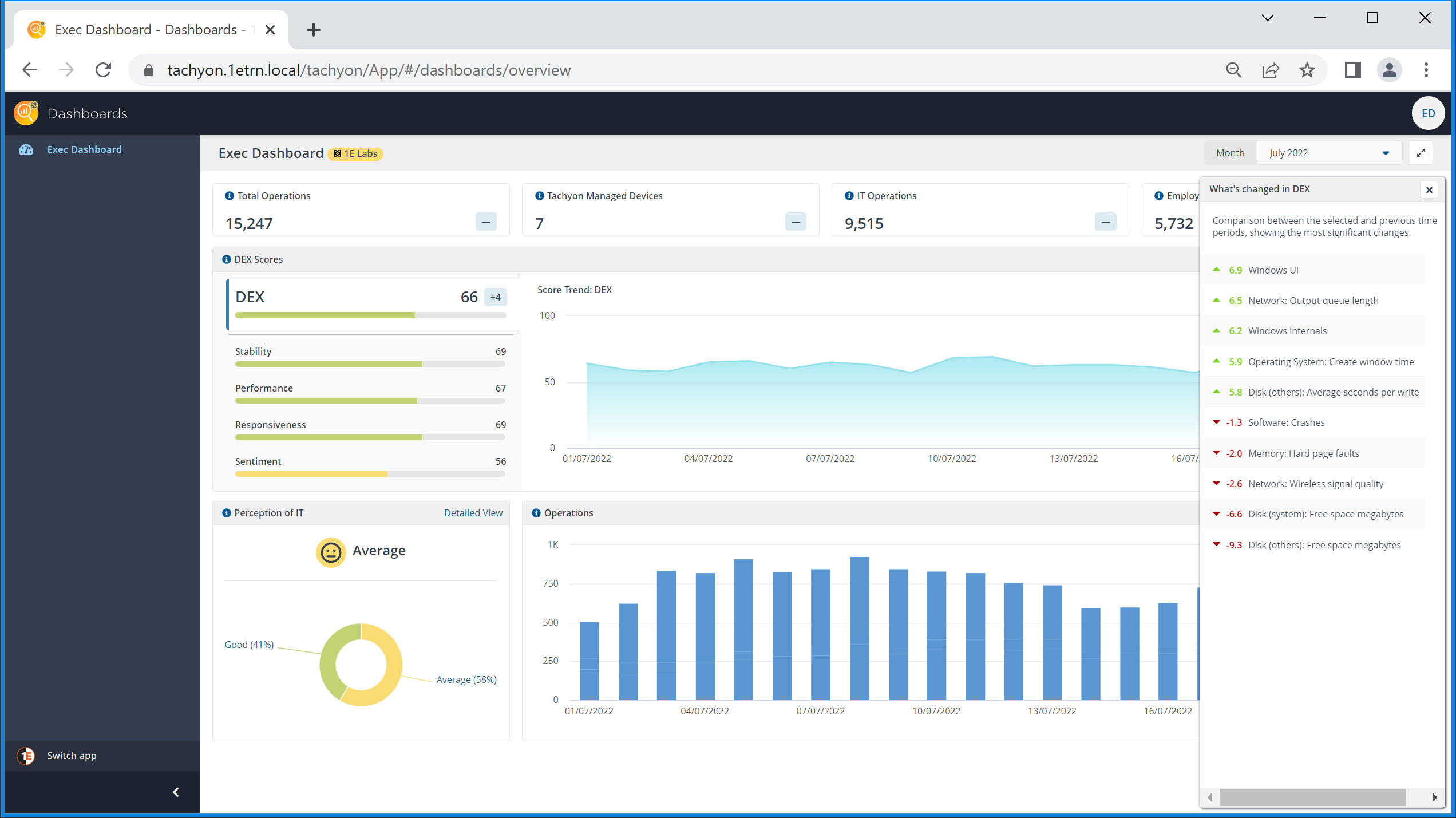
Looking at What's changed in DEX
The dashboard shows information from Experience that highlights how the company is doing from a DEX perspective. The DEX Scores tile presents the CIO with an overall view of their DEX score and shows how it has changed since the previous month. This overall averaged score consists of the distinct Stability, Performance, Responsiveness and Sentiment scores (also averaged). Clicking on the What's changed in DEX link displays details on the metrics that are reported on by Experience have gone up or down in terms of their largest impact on DEX.
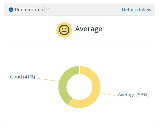
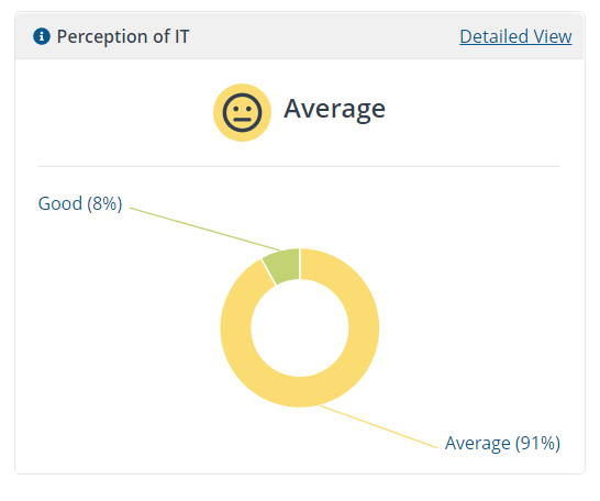
The Sentiment score is related to all the sentiment surveys that have been sent out and responded to by end-users. The Perception of IT tile is related to the responses of just the Perception of IT sentiment survey.
Comparing Operations with the Stability score
Scanning along the Operations chart, the CIO can see there's a peak of operations on the 19th of June, they can check through the DEX data to see if there are any correlations with this peak. Clicking on the Stability score shows the Score Trend: Stability chart. Here they can see that there's a corresponding peak in device stability, it might be that some remediation or actions that took place on that day were having a positive effect on system stability - and perhaps checking with their IT manager to see what the additional operations were related to.
How is my IT department doing?
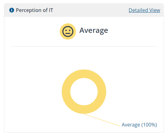
The CIO can get a feel for how their IT department is perceived by their employees, by checking the Perception of IT tile. The values that are shown are the averages of each user's responses, which are then counted and placed into one of five buckets:
Very Good
Good
Average
Poor
Very Poor.
Each bucket with values is then plotted using a donut chart, and the largest segment is then displayed as the overall rating.
For example, in our example in July the largest segment with values is Average, which is used as the overall rating - with 58% of the respondents averages falling into that. All the other respondents averages fall into the Good rating - the percentage values displayed are rounded down. This tells the CIO that overall the responses are average, but with a large chunk tending towards good. So how does this compare with the previous month?
Looking at the data for previous months
Clicking on the Month selector, at the top-right of the Exec Dashboard page, lets the CIO change which calendar month of data is displayed on the screen. There are only three months covered, the partial data for the current month, the full aggregated data for the preceding two months.
For the months before the current one, the change indicator at the bottom-right of each headline tile displays the deltas between the selected month and the one before. For the month of June 2022, the CIO can see that the Total Operations for that month are up 28% when compared with May 2022.
Focusing on the Perception of IT tile, the CIO sees that in the previous month there was a smaller percentage of respondents, just 8%, where they averaged out to Good. So things have improved in July so far, where the number of Good respondents is up to 41%.
Looking at the earliest month
The CIO now uses the month selector to look at the data for the earliest available month.
Here they can see that their Perception of IT score has a completely average set of results. Indicating that the average for each user that replied to the survey is coming out as Average.
So in May the Good percentage was 0, that is it didn't appear in the chart at all, in June it was up to 8% and currently in July it's at 41%.
So that's two months in a row where the Perception of IT responses have been improving. Even in the latest month they are still with the overall rating of Average, but the number of Good responses are increasing, and that may be a sign of a good trend for the CIO's IT department.