Custom Response Visualizations
Adding custom response visualizations to instruction definitions.
Tachyon allows custom visualization of responses in the form of charts and tables in Explorer along with existing default table based response display, this is useful because:
Users can view responses in graphical format.
The same data can be presented from different perspectives.
Responses can be highly summarized.
Note
This feature has been disabled from the Tachyon platform 24.1.1 release.
Everyone likes a pretty graph
Presenting data is a tabular way is all good and well, but as the volume of data grown, it gets easier to lose the big picture. Aggregating data helps to present it in a more concise manner, but to allow the user to get a good picture of the situation in just a few seconds, you need a graph.
Response Visualizations
Visualizations are Tachyon’s way to allow you to present the data as graphical form. In a way, they are a fancy way of saying “put this is a chart for me”.
Tachyon supports several chart types: Pie, SmartBar, Line, Bar, Column, Area and StackedArea.
Pie and Area are designed as “2d” or “single series” charts while the rest are designed to be “3d” or “multi series” charts. Some of them (like Bar and Column) can be used as 2d but they don’t look quite right – while the data is correct, the colours are wrong.
But the charts themselves are not enough. You need a way to process the responses so that they can be displayed in one of the charts. The processing is done by something we call a response processor. Tachyon has several processors built-in, like date-time single series, date-time multi series, default single series and default multi series. You can also provide your own code to do the processing but that is beyond the scope of this article.
Configuration basics
The examples below will have the raw configuration Json that each graph uses, so let’s quickly go over the fields in that Json to give you an idea what they mean.
Each chart should be uniquely identified by its Id field. It is up to you what that unique value is. You can put a Title on the chart and choose from one of several chart types available.
X defines which column from the schema to use as X axis, Y does the same for value. Z axis is available on the 3d charts and allows you to pick the column over which to aggregate the data. PostProcessor defines which processing function to use and multiple charts can use the same function and essentially plot the same data differently if you so desire, or each chart can use its own processing function. Parameters of each function can be found in the documentation and they are outside the scope of this article.
Row defines which row the chart should be in. This value becomes important if you have more than one chart and helps you define if the charts should be side by side, in which case they would have the same row number, or one over another, where they would have different row numbers.
To aggregate or not to aggregate
Aggregated data is readily available and is relatively small in volume and can be processed quickly, even if the processor has to do extra aggregations. Dealing with raw data would mean the processor would potentially have to process hundreds of thousands of rows in order to produce the data for the graph. That would put an undesired strain on the server and should be avoided at all costs.
So, to all intents and purposes, graphs deal with aggregate data. If you want to use a visualization in one of your instructions, that instruction must have an aggregation schema and you should use columns from the aggregate schema as your X, Y and Z axis.
Please remember that using aggregated data in the chart is separate from aggregating over the Z axis in a 3D chart. 3D charts will, effectively, aggregate the input data, which has already been aggregated by the database.
2d vs 3d
Is short, a 2d chart is a chart that displays a single series of name-value elements, while the 3d one groups entries and then displays series of name-value elements for each grouping.
This does sound a bit convoluted but in a moment, I’ll show you some examples and it will become much clearer.
Single series (2d) charts
Let’s looks at a few single series charts. First, I’ll show you time-based chart that use the date time processor.
As an example we’ll look at an instruction that looks on DNS resolutions over time. This instruction has a simple aggregated schema with two columns: TimeStamp and Count.
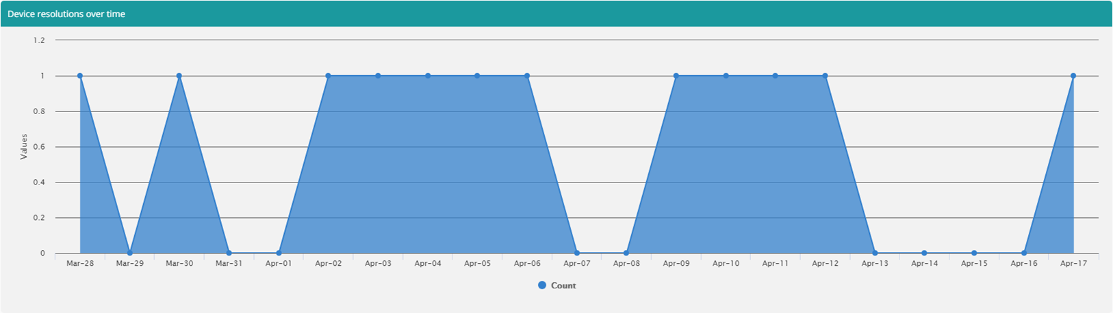
Above graph has following configuration:
JSON
{
     "Name": "default",
     "TemplateConfigurations": [{
           "Id": "leftArea",
           "Title": "Device resolutions over time",
           "Type": "Area",
           "X": "TimeStamp",
           "Y": "Count",
           "Z": "Fqdn",
           "PostProcessor": "processingFunction",
           "Size": 1,
           "Row": 1
     }],
     "PostProcessors": [{
           "Name": "processingFunction",
           "Function": "ProcessDateTimeSingleSeries('TimeStamp', 'Count', 'day', 'MMM-dd', 'Count')"
     }]
}
Moving away from the time-based data, we have everyone’s favourite – the pie chart.
The instruction we’re looking at shows count of disable services and has two columns: Caption and Count. 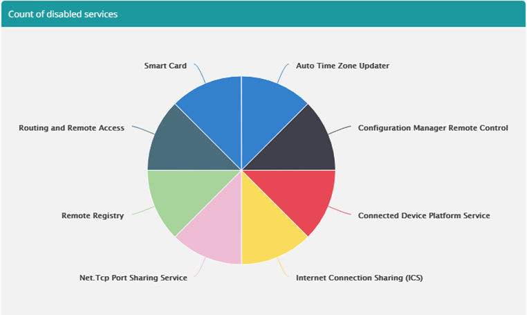
And here’s the configuration:
JSON
{
     "Name": "default",
     "TemplateConfigurations": [{
           "Id": "mainchart",
           "Title": "Count of disabled services",
           "Type": "Pie",
           "X": "Caption",
           "Y": "Count",
           "PostProcessor": "processingFunction",
           "Size": 1,
           "Row": 1
     }],
     "PostProcessors": [{
           "Name": "processingFunction",
           "Function": "ProcessSingleSeries('Caption', 'Count', '10', 'Count', 'true')"
     }]
}
Multi series (3d) charts
Now let’s looks at a multi series chart that plots data over time
Here we have an instruction that returns aggregated data with following schema:
Fqdn
Timestamp
Count
And the aggregation is performed over Fqdn and Timestamp fields. Based on that data, we’ll plot two graphs.
First one shows Domain name resolutions over time.
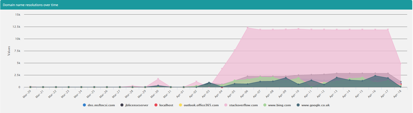
This was achieved by using following template configuration:
JSON
{
     "Id": "leftArea",
     "Title": "Domain name resolutions over time",
     "Type": "Area",
     "X": "TimeStamp",
     "Y": "Count",
     "Z": "Fqdn",
     "PostProcessor": "processingFunction",
     "Size": 1,
     "Row": 1
}
Same data is then used to plot total resolution per day:
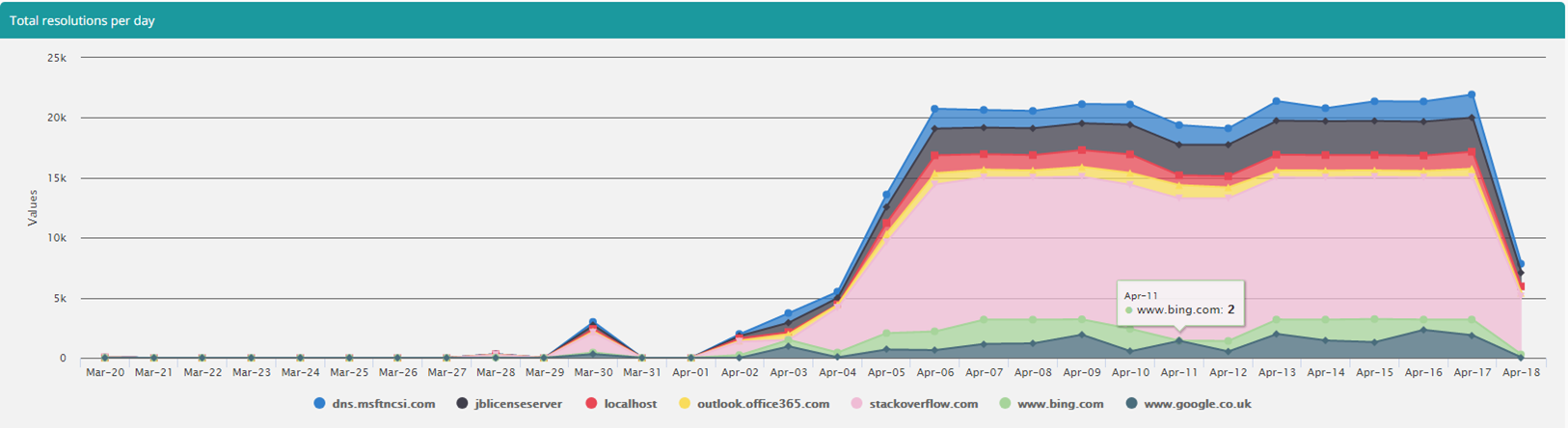
Using this configuration:
JSON
{
     "Id": "bottomStackedArea",
     "Title": "Total resolutions per day",
     "Type": "StackedArea",
     "X": "TimeStamp",
     "Y": "Count",
     "Z": "Fqdn",
     "PostProcessor": "processingFunction",
     "Size": 1,
     "Row": 2
}
And the processor definition that serves both looks like this: JSON
{
     "Name": "processingFunction",
     "Function": "ProcessDateTimeMultiSeries('TimeStamp', 'Count', 'Fqdn', 'day', '7', 'MMM-dd', 'false')"
}
As you can see we’re grouping over the Fqdn column, which will give us our series. Then within each grouping we have a series consisting of a value for a given date.
The entire response visualization configuration looks like this:
JSON
{
     "Name": "default",
     "TemplateConfigurations": [{
           "Id": "leftArea",
           "Title": "Domain name resolutions over time",
           "Type": "Area",
           "X": "TimeStamp",
           "Y": "Count",
           "Z": "Fqdn",
          "PostProcessor": "processingFunction",
           "Size": 1,
           "Row": 1
     },
     {
           "Id": "bottomStackedArea",
           "Title": "Total resolutions per day",
           "Type": "StackedArea",
           "X": "TimeStamp",
           "Y": "Count",
           "Z": "Fqdn",
           "PostProcessor": "processingFunction",
           "Size": 1,
           "Row": 2
     }],
     "PostProcessors": [{
           "Name": "processingFunction",
           "Function": "ProcessDateTimeMultiSeries('TimeStamp', 'Count', 'Fqdn', 'day', '7', 'MMM-dd', 'false')"
     }]
}
But of course, we can plot a multi series that doesn’t necessarily use time on the X axis. We can have any value there.
As an example we’ll use an instruction that returns all software installed on the system. This instruction is aggregated by publisher, product and the product’s version and gives a simple count. 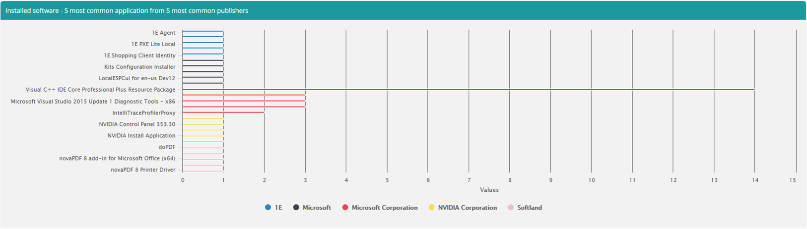
The chart above shows us the 5 most common apps from 5 most common publishers. To achieve that, we grouped over the Publisher and used Product as our X-axis with the count being the value. It’s worth noting that this will include all versions of a given product, since taking that into account would require another level to the chart.
Here’s configuration for the chart above:
JSON
{
     "Name": "default",
     "TemplateConfigurations": [{
           "Id": "mainchart",
           "Title": "Installed software - 5 most common application from 5 most common publishers",
           "Type": "Bar",
           "X": "Product",
           "Y": "Count",
           "Z": "Publisher",
           "PostProcessor": "processingFunction",
           "Size": 1,
           "Row": 1
     }],
     "PostProcessors": [{
           "Name": "processingFunction",
           "Function": "ProcessMultiSeries('Product', 'Count', 'Publisher', '5', '5', 'false')"
     }]
}
Showing Multiple Chart types on one page
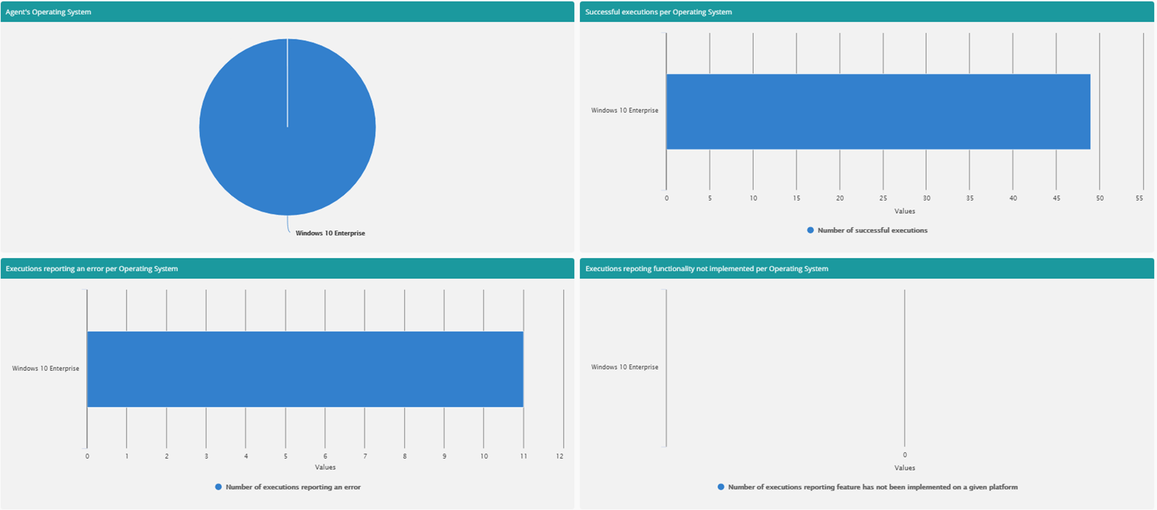
Just to wrap things up, here’s an example that uses multiple graphs arranged over two rows.
Each graph has its own processor to go over data that is aggregated on Agents column and has four other columns, each representing a sum of all occurrences of a specific state (Success, Error, NotImplemented, PayloadTooLarge):
TotalExecutionsSuccessful
TotalExecutionsErrored
TotalExecutionsNotImplemented
TotalExecutionsPayloadTooLarge
And here’s the full configuration Json:
JSON
{
     "Name": "default",
     "TemplateConfigurations": [
     {
           "Id": "TopLeftArea",
           "Title": "Agent's Operating System",
           "Type": "Pie",
           "X": "OperatingSystem",
           "Y": "Agents",
           "PostProcessor": "OsAgentCountProcessor",
           "Size": 1,
           "Row": 1
     },
     {
           "Id": "TopRightArea",
           "Title": "Successful executions per Operating System",
           "Type": "Bar",
           "X": "OperatingSystem",
           "Y": "TotalExecutionsSuccessful",
           "PostProcessor": "OsSuccessCountProcessor",
           "Size": 1,
           "Row": 1
     },
     {
           "Id": "BottomLeftArea",
           "Title": "Executions reporting an error per Operating System",
           "Type": "Bar",
           "X": "OperatingSystem",
           "Y": "TotalExecutionsErrored",
           "PostProcessor": "OsErrorCountProcessor",
           "Size": 1,
           "Row": 2
     },
     {
           "Id": "BottomRightArea",
           "Title": "Executions repoting functionality not implemented per Operating System",
           "Type": "Bar",
           "X": "OperatingSystem",
           "Y": "TotalExecutionsNotImplemented",
           "PostProcessor": "OsNotImplementedCountProcessor",
           "Size": 1,
           "Row": 2
     }],
     "PostProcessors": [{
           "Name": "OsAgentCountProcessor",
           "Function": "ProcessSingleSeries('OperatingSystem', 'Agents', '10', 'AgentCount', 'true')"
     },
     {
           "Name": "OsSuccessCountProcessor",
           "Function": "ProcessSingleSeries('OperatingSystem', 'TotalExecutionsSuccessful', '10', 'Number of successful executions', 'true')"
     },
     {
           "Name": "OsErrorCountProcessor",
           "Function": "ProcessSingleSeries('OperatingSystem', 'TotalExecutionsErrored', '10', 'Number of executions reporting an error', 'true')"
     },
     {
           "Name": "OsNotImplementedCountProcessor",
           "Function": "ProcessSingleSeries('OperatingSystem', 'TotalExecutionsNotImplemented', '10', 'Number of executions reporting feature has not been implemented on a given platform', 'true')"
     }]
}
And the charts themselves: