Experience Analytics menu
The Experience Analytics menu contains a number of pages. We recommend the Overview page as the starting place for any Tachyon Experience journey where you can get immediate answers to how your enterprise is performing from an end-user perspective, and you can drill down to get details on specific problem areas and find routes to immediate resolutions.
Overview page
The Overview page is the starting place for any Tachyon Experience journey. Here you can get immediate answers to how your enterprise is performing from an end-user perspective and you can drill-down to get details on specific problem areas and find routes to immediate resolutions.
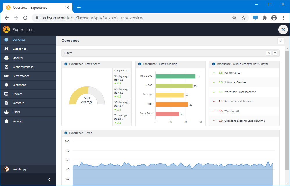
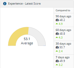
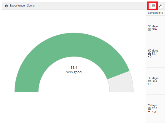
Your key indicator is the Experience - Latest Score chart, which gives your enterprise a score out of 100 based on a combination of measured events and user surveys. The closer you are to 100 the better the IT experience your end-users are having.
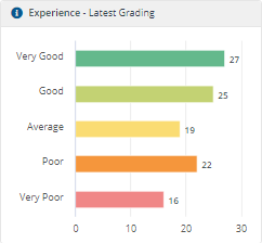
The Experience - Latest Grading chart provides a breakdown of the experience score showing how many devices and users fall into each of the five experience grades - ranging from Very Good to Very Poor. This helps interpret the experience score and see how it maps onto end-user experiences.
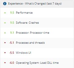
The Experience - What's Changed (last 7 days) chart provides an overview of the significant changes, good or bad, that have occurred during the past week.
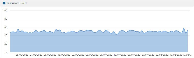
Finally you can use the Experience - Trend chart to check how well your enterprise is performing over time in terms of how your end-users see it. You could use this chart to help gauge progress on any improvement programs you might have put in place or act as an advanced warning that there are underlying issues that are affecting your end-users and need resolving.
Without filters, the dashboard shows the status of all devices in the environment and all of their subsequent scores. When filters are added, the dashboard is recalculated according to the applied filter. For an explanation of filters, please refer to Filters and Breakdown bar.
Hovering over the icon in the upper left corner of any tile shows the name of that tile or the metric that tile is displaying.
Dashboard charts
Experience - Latest Score
This tile shows the overall score with a sidebar showing the score over the last week, month, 60 day, and 90 day periods. It will show the difference in the score over that time period. Clicking into the colored portion of the chart will take you to additional details.
For details on the calculation of the Experience Score please refer to The Scores: Experience Score.
Experience - Latest Grading
The Grading tile allows you to see the numbers of devices for each score. You can drill into each of the ratings - Very Good, Good, Average, and Poor to see the devices that have that score. This allows identification of the poorly performing devices very quickly.
Experience - What's Changed (last 7 days)
This tile shows you the score over a period of days and the amount of change in the score. A negative number is reflected in Red and shows the performance has worsened. A positive number is reflected in Green and shows that the performance has improved.
Experience - Trend
The trend tile shows the score over a succession of days. Any area on the line can be highlighted and the date and the score for that day viewed.
Clicking on the View Detailed data button at the top of any tile brings up the Raw data
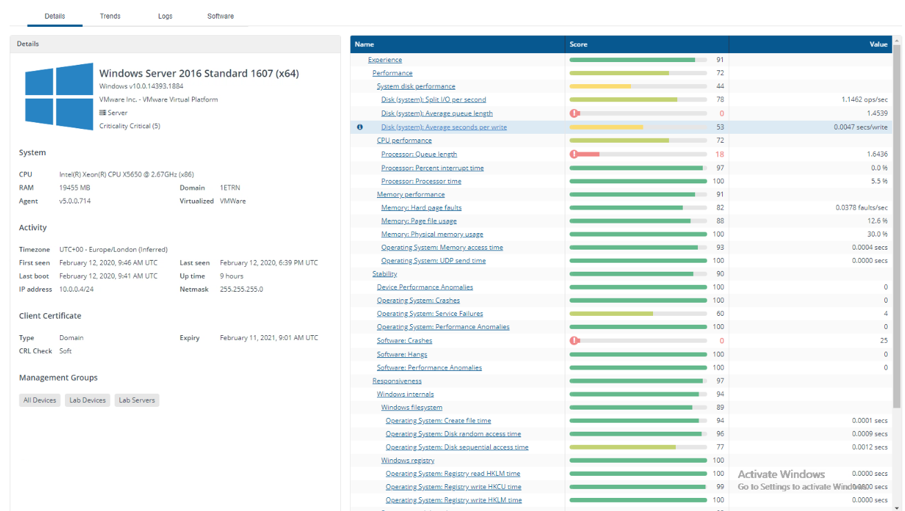
This presents a box of the raw data for the selection. Clicking on any of the devices opens the details page for the device.
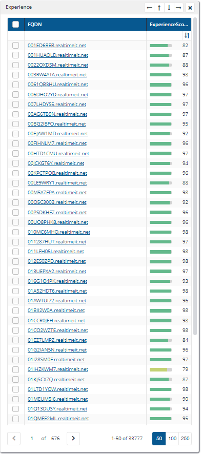
The details page shows all the metrics that are being collected. The colored bars represent the grading numbers. Any that are very poor will be red with an exclamation point.
Categories page
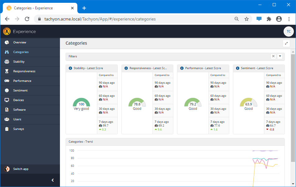
The Categories page shows a dashboard of the scores from each of the four categories:
The first row of tiles shows the Latest Score view from each of the categories. Clicking on one of these tiles opens the related page in Experience.
The tiles either display information on the entire estate, if no filtering has been selected, or just the devices that are covered by the filtering query. For example, if the selected filter is High Criticality - the tiles will only contain devices that were configured as High for Criticality.
The tile on the bottom row shows the trend for all the categories over time.
Stability page
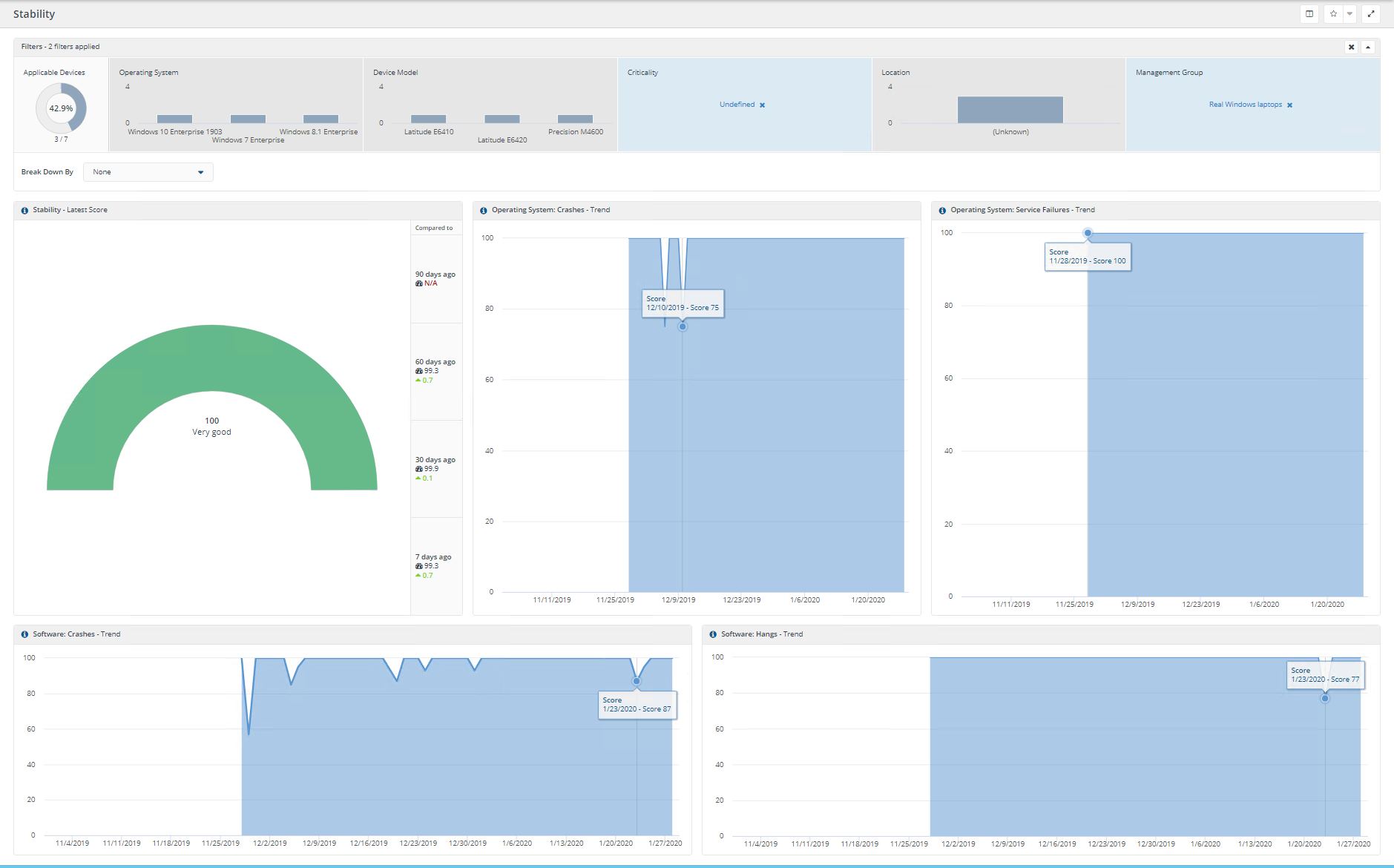
The stability score is derived by measuring the "crashiness" of applications and the operating system of a device. The different types of crashes have a differing impact on the score, based on the amount of impact on the end-user.
An application crash is annoying but the crash of the entire operating system could cause data loss so has more weight on the score. The page allows you to drill into the tiles to see the different metrics that are collected. For information on the makeup of the score see Stability Score
Stability - Latest Score Tile
The Latest Score tile can be selected for additional details. This is the view when selecting the Latest Score Tile with the Filters bar collapsed.
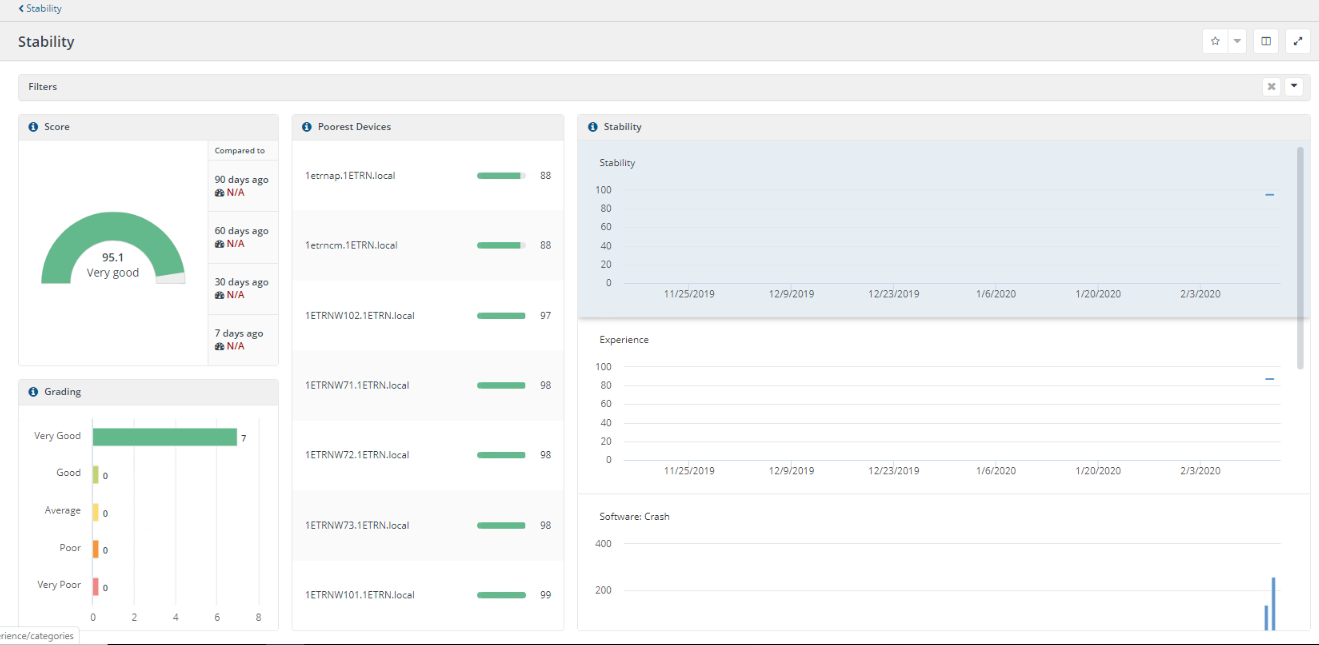
This view has the following tiles:
Score - with comparison history on the side
Poorest Devices in the Environment
Timeline of the Scores for Stability and Experience
Environment Stability Grading Bar Chart
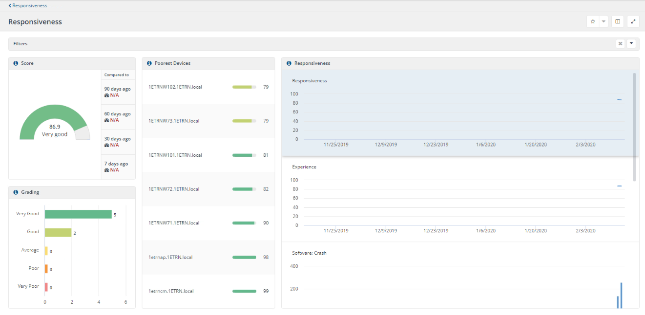
Responsiveness page
The responsiveness score is derived by measuring how well Windows application perform during our "Synthetic micro-transactions". The successful and timely operation of Windows and Windows applications is key to a positive user experience on that device.
The page allows you to drill into the Latest Score tile to see the different metrics that are collected. For information on the makeup of the score see Responsiveness Score
The Responsiveness Page
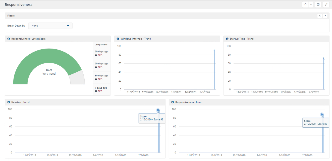
Responsiveness - Latest Score Tile
The Latest Score tile can be selected for additional details. This is the view when selecting the Latest Score Tile with the Filters bar collapsed.
This view has the following tiles:
Score - with comparison history on the side
Poorest Devices in the Environment
Timeline of the Scores for Responsiveness and Experience
Environment Stability Grading Bar Chart
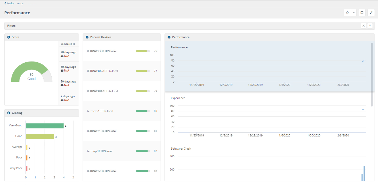
Performance page
The performance score is derived by measuring the performance of the device using the Windows Performance Counters. These counters measure many data points on the device including CPU usage, disk usage, memory usage, and processes.
The page allows you to drill into the Latest Score tile to see the different metrics that are collected. For information on the makeup of the score see Performance Score
More information on the Windows Performance Counters can be found here: https://docs.microsoft.com/en-us/windows/win32/perfctrs/performance-counters-portal.
The Performance Page
Performance - Latest Score Tile
The Latest Score tile can be selected for additional details. This is the view when selecting the Latest Score Tile with the Filters bar collapsed.
This view has the following tiles:
Score - with comparison history on the side
Poorest Devices in the Environment
Timeline of the Scores for Performance and Experience
Environment Stability Grading Bar Chart
 |
Sentiment page
The Sentiment page provides charts that focus on the Sentiment scores in Experience. You can also change the layout to add tiles for any User Sentiment Surveys you have created.
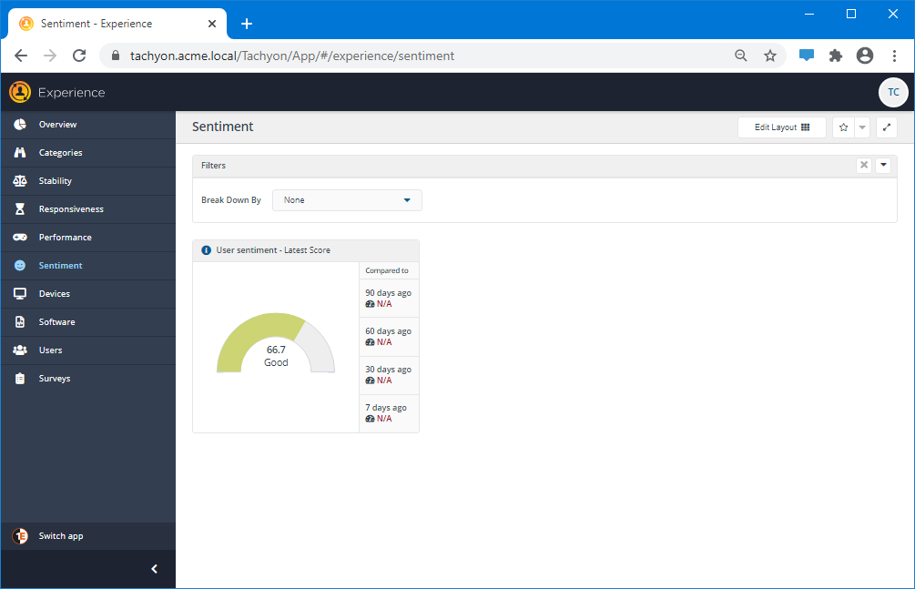
The Sentiment page
This page is the dashboard for monitoring your network's User Sentiment score and any User Sentiment Surveys you have created.
Editing and storing the Sentiment page layout
To display your own User Sentiment Surveys on the Sentiment page you click on the Edit Layout button to add the new metrics that are related to the Surveys. Once you have configured
Filters
You can apply filters and different breakdowns for the data displayed on the Sentiment page.
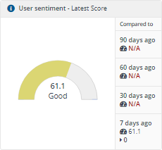
User sentiment - Latest Score tile
The default tile displayed on the Sentiment page is the User sentiment - Latest Score tile. This shows the latest User Sentiment score along with comparisons between the current date and those of 7, 30, 60 and 90 days ago. If you don't have enough data yet the relevant section of the Compared to column shows the text N/A to indicated that it's not applicable.
User sentiment page
Clicking on the User sentiment - Latest Score tile displays the User sentiment page. Here there are tiles for the Score, Poorest Devices, User sentiment, Experience and Grading.
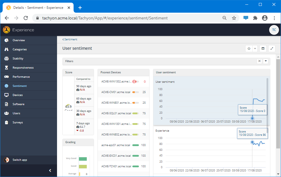
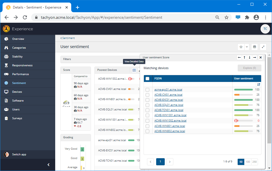
User sentiment Score panel
Clicking on the View Detailed Data button on any of the tiles displays the User sentiment Score details, as shown in the picture opposite, which is a list of the devices and their current User sentiment scores. From here you can navigate to a device page by clicking on the device's FQDN, or make a selection and click on the Explore button to open the Explorer Application with the selected devices set as the scope.